


Good Maps of the LA Fires

A week ago I did an episode with Priscilla Cole about her organizing the Geospatial Risk Summit:

The timing was, unfortunately, impeccable. The day after the episode was released, a fire began in LA. It is still burning and 16 people are dead. The fires have been a tragedy. Everyone will have their own poignant image to illustrate the impact. Here is one I saw just now on Bluesky:
Speaking of images, the geospatial industry has gone into overdrive producing some iconic material. I started to notice people publishing analysis and dashboards the day after, January 8th. Personally, the first one I saw on LinkedIn was from past guest Frank Romo:

Here’s the link to his app:

It is a useful situational awareness app. Users can put a pin on the map or enter an address, select a distance and it will return active fires nearby.
I knew we were getting somewhere with this unforgettable display of burnt buildings in a combined visible and infrared spectrum image from Maxar shown first in a CNN update on January 9th:

It is an iconic image. It is also a great illustration of what our various sensors can do. As described by CNN, the image was taken when there was cloud cover. This indicates how we have technology to see through haze and smoke (but not cloud - thanks to Kevin Bullock for clarifying) to produce an arresting scene instantly recognizable as fire.
In terms of how things came at me, this was followed by another podcast guest, Alex Wagner of SeerAI:

He posted a dashboard on Jan 10th:

This:
…combines Microsoft Planetary Computer Building Footprints; NASA - National Aeronautics and Space Administration Fire data; and crowd-sourced aid/resource sites.
I then asked him to put the transmission lines on as there has been a lot of reporting from WSJ about poorly managed vegetation encroachment leading to fires from PG&E’s assets:
Los Angeles Utility Didn’t Implement Common Wildfire Safety Measures
PG&E Is Racing to Stem Increasing Fires Ignited by Its Power Lines
Soon after, these updates were announced:
1. Cal Fire Emergency Incidents (https://lnkd.in/g5Rk6zBA)
2. Electricity Transmission Lines
3. Before/After SAR imagery (we are working on adding some higher-resolution data)
*Dashboard note: you can toggle layers such as SAR before/after in the control in the upper right of the map
The community not only provided maps but also commentary on what may have caused the fire such as this from David Marvin of Planet:
What could have been done to avoid such a catastrophic scenario? Outside of not building these communities in the first place: nearly nothing. This was not a wildland/forest/vegetation fire. This was an urban conflagration. All of the forest management and prescribed fire in the world would not have prevented the lion share of damages that we saw here. An ignition so close to densely packed homes in 60+ mph winds during nearly 0% humidity after 9 months of local drought is a perfect confluence of events to create such an outcome.
We don't yet know what caused these fires. But there are just too many sources of ignitions in (sub)urban regions to claim it could have been prevented with certainty. Unless you put out an ignition within a couple of minutes, winds that strong means too many homes will start burning (and casting extraordinary amounts of embers onto other nearby homes) for firefighters to be able to do much except get people out. No amount of working hydrants or aerial attack will stop the spread at that point.
Emphasis mine. He and Andrew Foote offered further reflection on propagation here:

It appears that it may not be as straightforward as blaming it on transmission lines like some other fires. For what it’s worth, this is what Alex’s app shows about proximity of transmission lines (yellow lines below) to the Eaton and Palisades fires:


One last thing about Alex’s post is that Ryan Kmetz responded with some code to pull swimming pools out of imagery. Inspired presumably by this:
Next up was another podcast guest Spatial Risk Systems:

They posted some information ranking top ten past fires by damage costs, with California dominating the list, along with one resilience indicator, median income:

It appears that Pacific Palisades has a very high median income which is in no way to suggest this is any less tragic. One way to put it is that Mel Gibson’s house burnt down whilst he was on Joe Rogan, January 9th:
This brings up the question I posed to Priscilla in the Geospatial Risk Summit episode about losses registered for insurance companies that historically have made very large sums of money until climate change caused a spike natural catastrophes and associated insurance losses. Perhaps the Hollywood elite losing their homes to something arising from climate change will mean that all of us have a brighter future facing this peril as the rich and powerful are forced to do something.
Expanding on the technology we can bring to bear on emergencies like this, we had help from another former podcast guest SkyFi:
They posted a video about how synthetic aperture radar can go through clouds. In turn, they mentioned yet another guest Umbra:

…stating that they had released free SAR imagery of the area affected.
Then we were on to Microsoft AI For Good, a new organization to me. A couple of Microsoft staff Taylor Corbett and Juan M. Lavista Ferres started posting analyses of buildings damaged by the fire along with a nice interactive web app showing before and after imagery along with colour coded building footprints:

For example, on Jan 10th Juan stated for the Palisades:
Key Findings from Los Angeles Imagery Analysis:
17,835 buildings analyzed:
6,251 are obscured by clouds, shadow, or smoke.
9,229 are likely unaffected (as of 1/8, 2:21 PM PT).
2,355 are likely affected by the fires.
As such, whilst the fires were still burning, our profession was already posting building damage counts based on rapid acquisition of satellite imagery and an algorithm to interpret it.
It was a really amazing day on LinkedIn just watching all these images, apps and assessments come in.
Soon afterward I came across an announcement that accompanying the free data from Umbra mentioned above, Maxar was doing the same.
I was just reposting everything I saw to my LinkedIn feed with the idea of consolidating it all here later, but Arunabha Gupta got in first with a summary of some of the work of the industry. Funnily enough, he is an employee of SwissRE, another podcast guest:

So we were starting to see some of the heavy hitters responding, speaking of which the next one I noticed was a post by Larry Lawrence from Intercontinental Exchange. This is the company that runs, amongst others, the New York Stock Exchange. His map showed things like schools and hospitals in the impact zone:

Somewhat hilariously, I can associate him with YET ANOTHER guest, Gillian Mollod, who now works at ICE herself:

Speaking of heavy hitters, finally a map app from Esri came up via James Killick (whose blog Map Happenings you should really check out). What’s great about this one is it is a 3D scene, enabling you to see the predictable spread of fires on hillsides:


On the analysis front, on Jan 12th Juan from Microsoft gave an Eaton fire update:
Here are the results for the affected area as of January 10, 2025, 2:56:39 PM PST.
31,356 buildings in this area:
27,202 houses were likely not affected by the fires
4,154 houses were likely affected by the fires.
He also shared a useful visualizer which had the same before/after imagery and color coded building damage estimates as the other one:

… with the addition of a short wave infrared image layer showing where fire had been detected:


Also on Jan 12th another podcast guest shared an app, GIScarta:

The app had an interesting new angle, live camera feeds. It also demonstrated the dashboard function of GIScarta, a new development in the past year if I recall correctly.

Same day, Jan 12th, Nearmap Insurance shared some before, during and after images via David Tobias. Good to see another heavy hitter sharing some work.


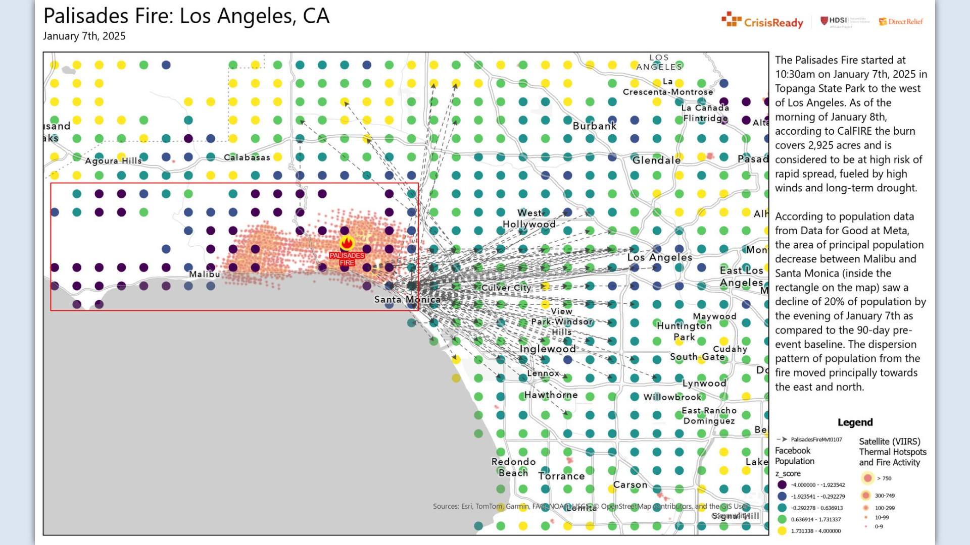
Also same day, Jan 12th, another <Insert name> For Good organization appeared, Meta’s ‘Data For Good’. This was via Andrew Shroeder, showing some very interesting analysis of human movement in response to evacuation orders. You can see an animation over time (my favorite!) on the second tab of the web app:


It shows in dark red dots where there are 50% fewer people than normal in an area, and in deep blue dots where there are 50% more than normal. It all comes from Meta/Facebook data somehow. Immediately raises privacy concerns/4th amendment breaches but nevertheless fascinating and a great effort by the Direct Relief organization.
We then had yet another imagery collection company, Vexcel posting what they had to contribute. Follow along here for some very high resolution aerial imagery updates:
With reduced winds and smoke on Friday [Jan 10th], our flight crew successfully collected imagery of the Palisades Fire and Eaton Fire, covering 360 km² of damaged properties and neighborhoods.


Funnily enough, they were mentioned in Jordan Regenie’s episode as contributing to the Bing Maps 3D cities campaign:

Then in the past 24hrs Juan posted another update about their completed Palisades damage assessment:
Total of 18538 structures:
11735 not damaged
6803 damaged
Dutifully doing his own collation, James Killick followed up on his Esri app post with one about the work of the BBC. I was quite critical of news media geospatial work throughout the fires but one has to credit the effectiveness of this:

Andrew Shroeder/Direct Relief then issued some more of these fascinating movement maps:

Then Ric Stevens posted a really useful Wildfire Aware app showing how many personnel are deployed where, clearly Palisades and Eaton fires are still the top firefighting priority in the US:

Rounding out the heavy hitters, Xan Fredricks posted about imagery available from USGS - she has also been a podcast guest:

It is honestly pretty hellish to look at:

By today, Jan 13th, the slew of analysis, apps, dashboards and imagery had petered out. Vexcel Data posted again, showing an update of building footprints where they had detected damage. One may have greater confidence than other assessments given this is based on aerial imagery:


And we should give credit where it’s due to the news media. We can end then with the Washington Post mentioning Watch Duty. This came up for me via Sophie Schmidt who said:
One app, made by a scrappy nonprofit, has been THE lifeline for millions of us. Watch Duty – a live map, staffed by volunteers listening to emergency fire radio – was the closest we got to real-time updates on the 10+ fires across LA in recent days. Watch Duty told me when fires suddenly erupted near me. Watch Duty told me when I had to evacuate.
They have a nice clear map with great symbology for fires:

You can get the app here. It is fitting that this is yet another volunteer effort and is a nice way to round out this incredible overall response from the industry where everyone has pitched in and served those affected for free with amazing technology, analysis and presentation.
So, that was a lot! I wasn’t expecting it to go on this long, it is hard to appreciate what is covered when one just reposts things on LinkedIn all day. I wanted to make sure I did this summary, however, as it is such an amazing example of what our industry can produce, in near real time, using space and airborne sensors, a radio transmission system to downlink it all, a few data centres and algorithms to process it all, and web map app platforms to display it to the public.
Why bother with this exhaustive effort do profile what everyone did? Well, I keep finding geospatial deficiencies in media reporting. I wanted to record everything here to illustrate what the public could get if a new, spatiotemporal centric media service were to be stood up. It seems a few like this idea:

Hopefully that is the last nat cat event before we all convene in Manhattan for Priscilla’s summit. For those coming, see you at the Hard Rock Hotel on Jan 30th.
Over and out.
Peter Hansen created a Damage Viewer for the Eaton and Palisades fires in LA. Really good resource. Here's the link - https://experience.arcgis.com/experience/de425c18e9ed46f4aff2937c25681c74/ And, here's the link to his LinkedIn - https://www.linkedin.com/feed/update/urn:li:activity:7283986045631639552/ (basically, an unofficial app from official sources).